I picked up FFXII again after coming home to finally beat the damn game once and for all. I remember back when I first saw the judge masters I thought they were going to be so badass but then as I killed them one by one I realized (gasps!) they're all so goddamn weak. Still I wanted to do a fanart to remember the times when they seemed cool

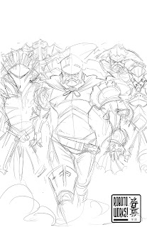
Step1: I started off with a sketch in photoshop, focusing mostly on Gabranth (middle) since he's the center of the focus. One of my main problem with the judges in the game was that proportionally they were too similar to each other, so I pushed the shapes more to help distinguish between the judges. In hindsight I could've tightened this sketch a little more to make things easier in the following steps...

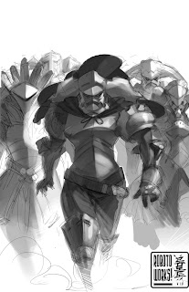
Step 2: Next I apply the tone, keeping in mind the focus of the picture and adjusting the level of darkness / contrast accordingly. Since lighting is the key I wanted to separate tone and color as separate process

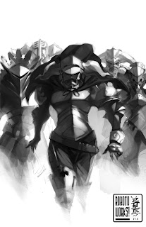
Step 3: Just tightening the tonal work. Since I knew I'll add a layer of color on top later I wanted to make sure the lighting worked in this stage before moving on. This is where I get rid of the lineart as I go

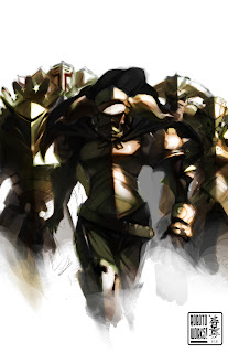
Step 4: I make a separate layer in 'overlay' and apply a layer of color, going for a warm wash for the light and cool wash for the shadow. I find it's easy to fall in the trap of being monochromatic when using this technique so you just have to use your sensibility and vary up the colors a bit.
What follows after is merging the layers together and tightening up some corners. I hope this gives you some insight on tackling subject like this.

